Redesign of Q&A list for Youjia App
Company: Baidu
Time:2021.03
Role: user research, ux design
Company: Baidu
Time:2021.03
Role: user research, ux design
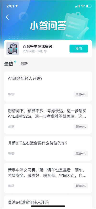
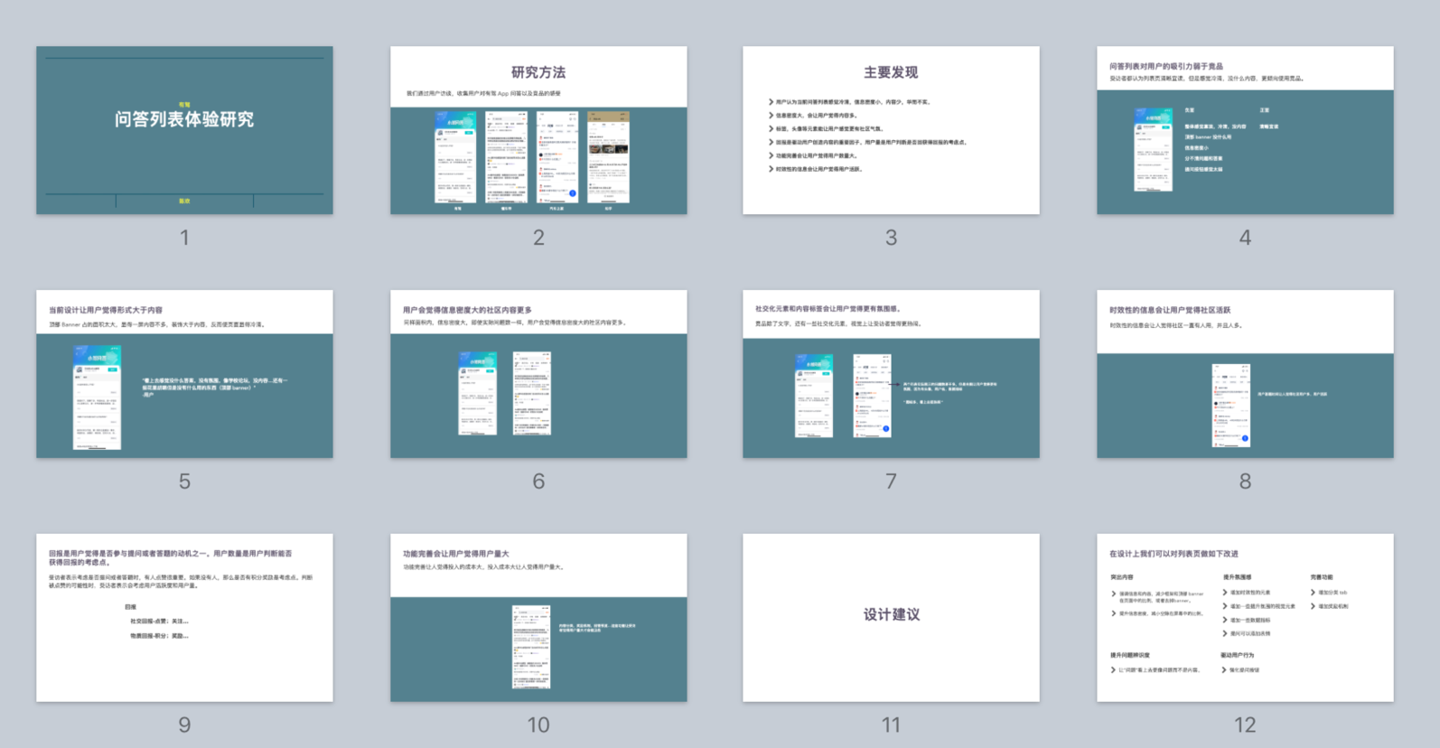
Youjia App’s Q&A community 1.0 version’s question list page looks like being lack of content and social atmosphere. This might lead to low user engagement.
I defined ux improvement strategy and key metrics for validation.
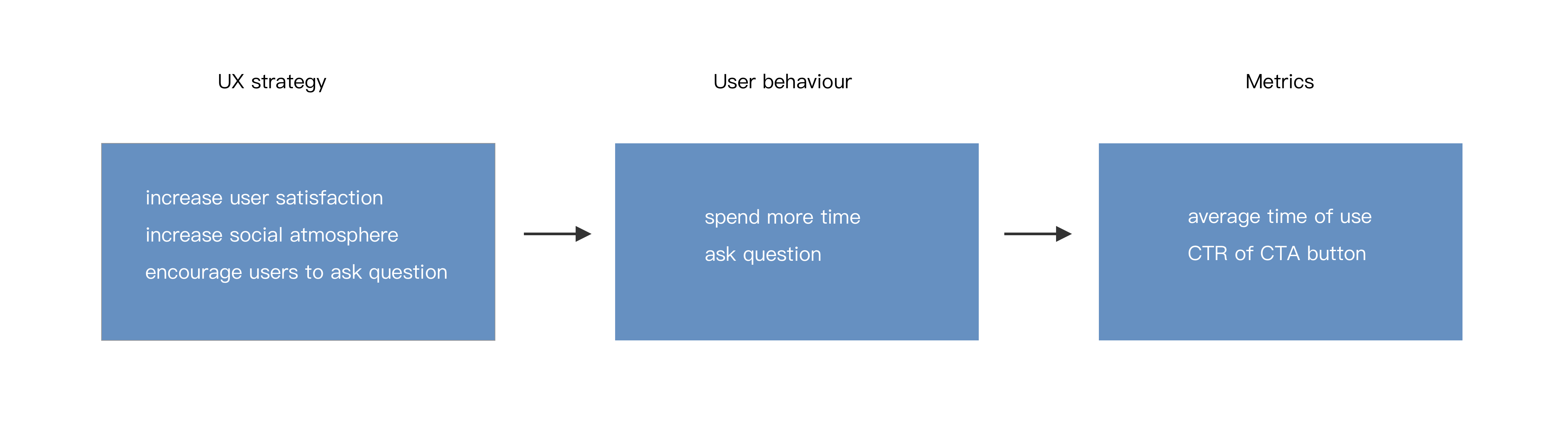
I conducted user interviews and took our own design and competitors' design as probe for discussion.
The research objective are:
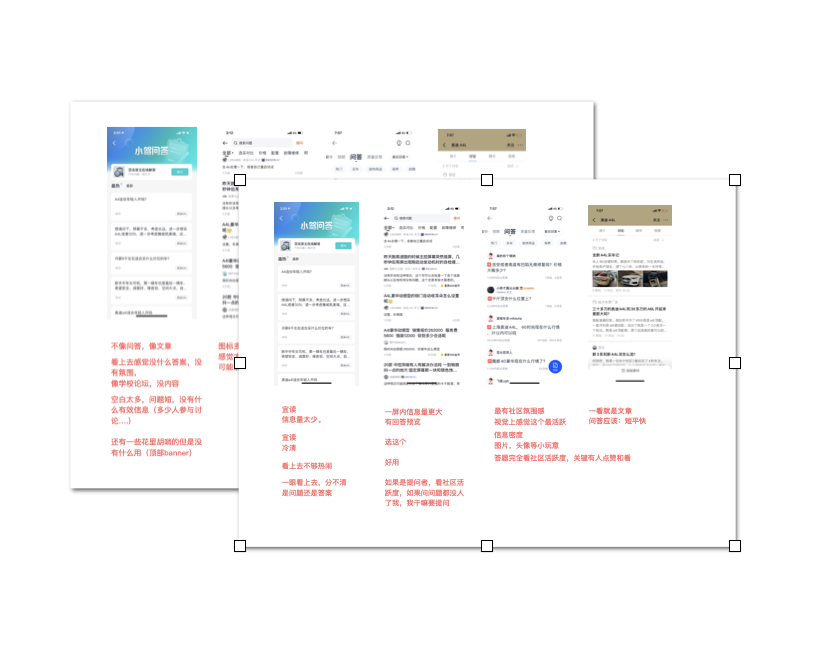
I have written a report and delivered it to PM.
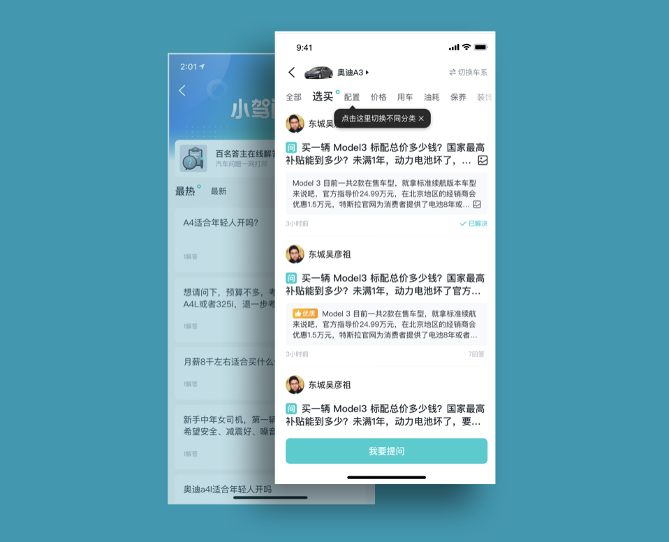
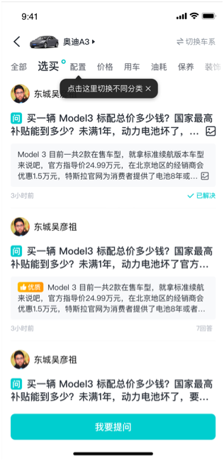
The new design has higher information density and more social elements. Tabs are added for selecting content by themes. We hope this make users feel that we have rich and large amount of content. A reward reminder lays on the screen, which tells if you answer a questions, you will get reward. The CTA button is placed at the bottom. It would disappear when user scroll the screen up so it wouldnt disturb the content browsing.
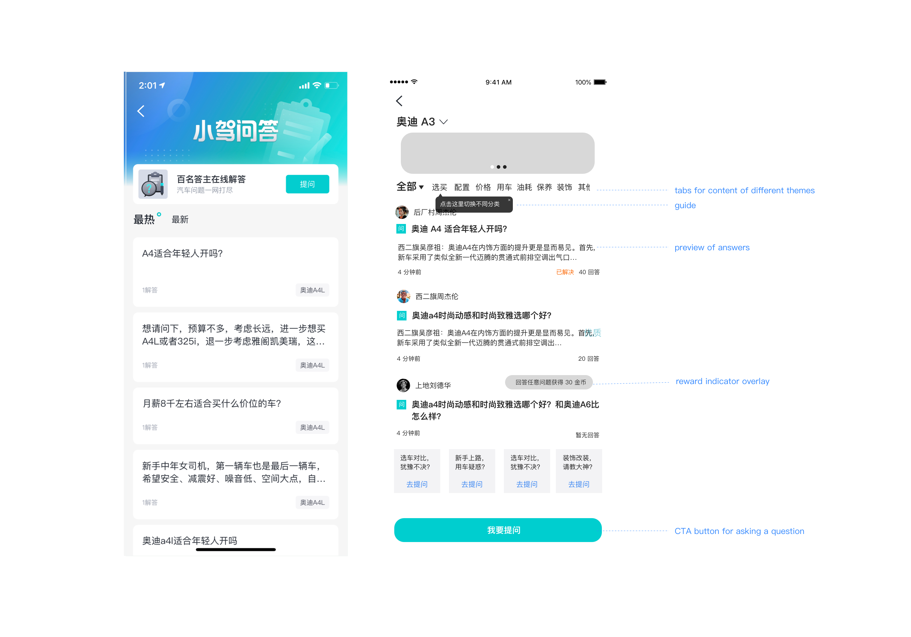
The visual design
The new version was launched in July, 2021 and we recieved positive results.
Comparing a week after launch and a week before